One of the things I am missing most during these troubled times is the ability to talk face to face with my customers about colour and print and combining all these things to come up with the perfect interiors scheme. Often at Aurina we discuss these ideas long before a customer is ready to put their scheme into place. They might buy a lampshade or take a swatch of fabric to better enable them to feel the print in their space with the colour they already have at home. I love to work with colour and prints and see which go together best and so I've been having a virtual wander around some of the more well known paint brands to see what they've been putting together and how that could work with our prints and designs.
In 2020 it seems that the colour combination of the moment is still pink and green but this year it's more subtle, more paired back a truly pretty combination. Light and bright but still with a sense of colour not grey.

This picture of a modern style kitchen features Light Peach Blossom and grey teal from Little Greene Paint Company thereby introducing the pink with a touch of safe grey. I think this could be lightened still further with the introduction of some soft furnishings or bone china perhaps.

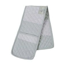
Adding the soft subtle green using soft cushions such as this wide stripe sage and stone cushion is an easy way to soften the grey tone of the kitchen cupboard with a simple soft green accompanied but a paler grey in a clean modern print. This could also be accented in aprons, oven gloves etc.

Pinking the pink up in other medium and accents would be easy with these charming soft subtle bone china.

Looking at another room in the house this charming Pea Green Library colour scheme could be used in a drawing room, hallway or bedroom.

I adore this Pea Green colour from Little Greene Company it's charming and soft and combined with white lead is soft and pretty. This combined with some soft furnishings or lamp shades in our soft pretty green peony print would be an absolute delight! I think I am going to use this in our spare bedroom which has been needing a refresh for a while.

If you want to add a green tinge but not be too green then a look like this from Farrow and Ball is a lovely option.

This painted cladding is painted in Treron No.292 which brings a green feel but with a touch of smudge to it too. This colour works brilliantly with lighter colours and almost uses green as a 'netural'. Combine this lovely colour with other neutrals and brown tinged colours. It would look lovely with old terracotta tiles and the tobacco colour used in our Dachsie print.

Just a few ways you can combine colour and design. All easy to achieve and bring your own sense of style to your home.


